Glass clarity, neutrality & optical design
Six consequences of packaging something invisible.
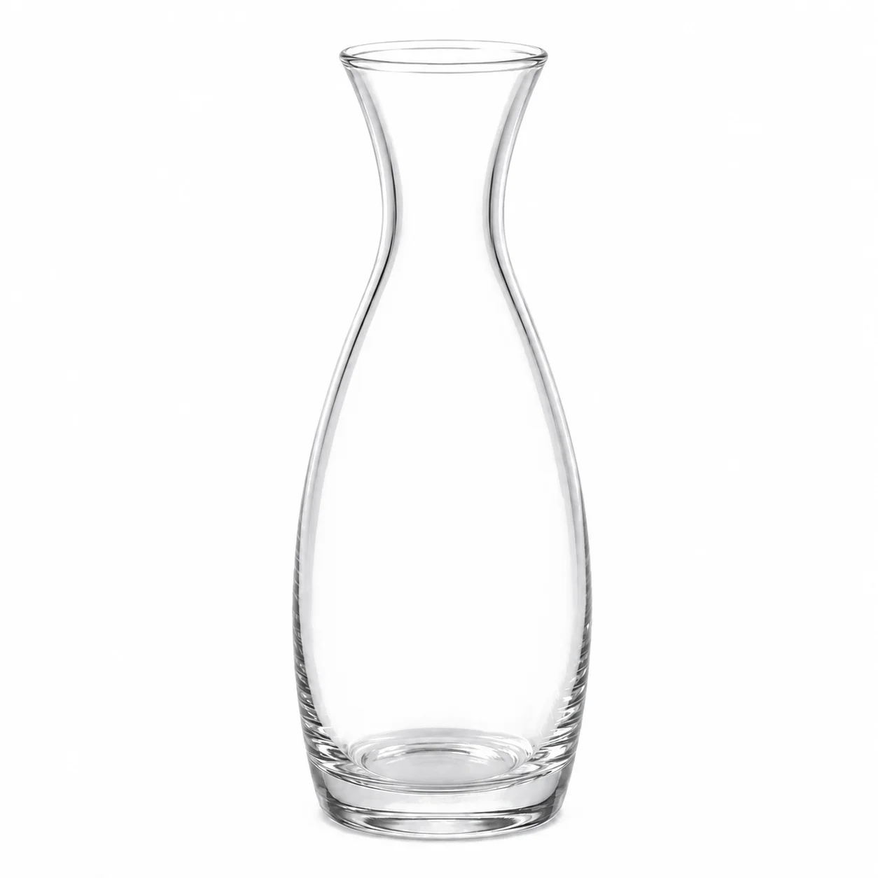
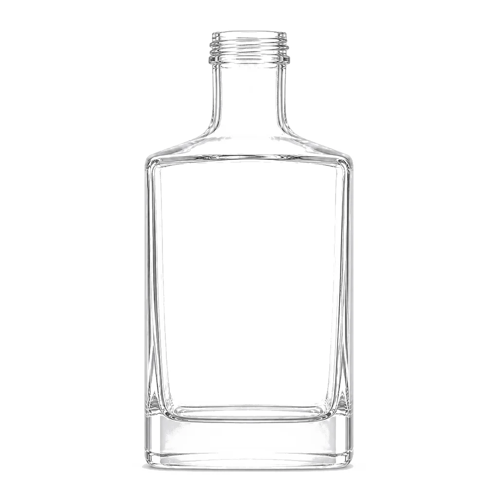
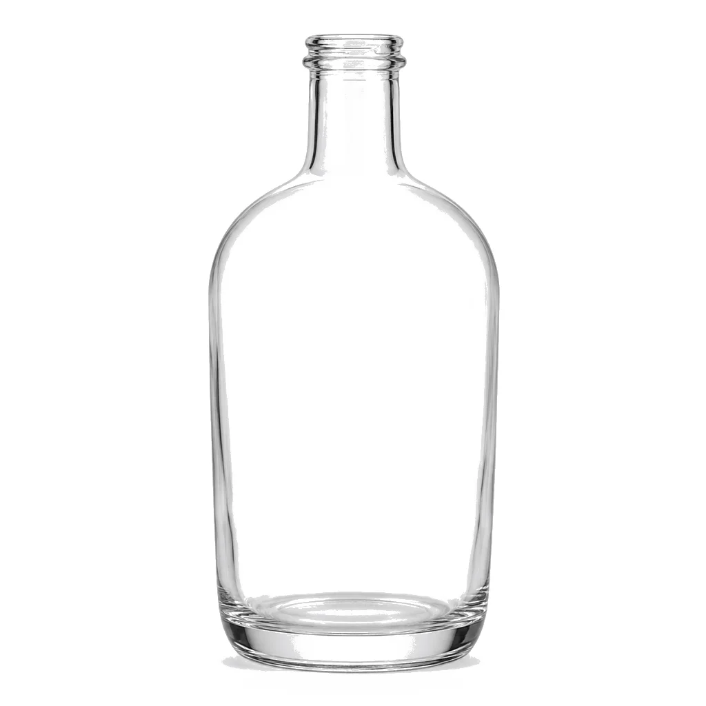
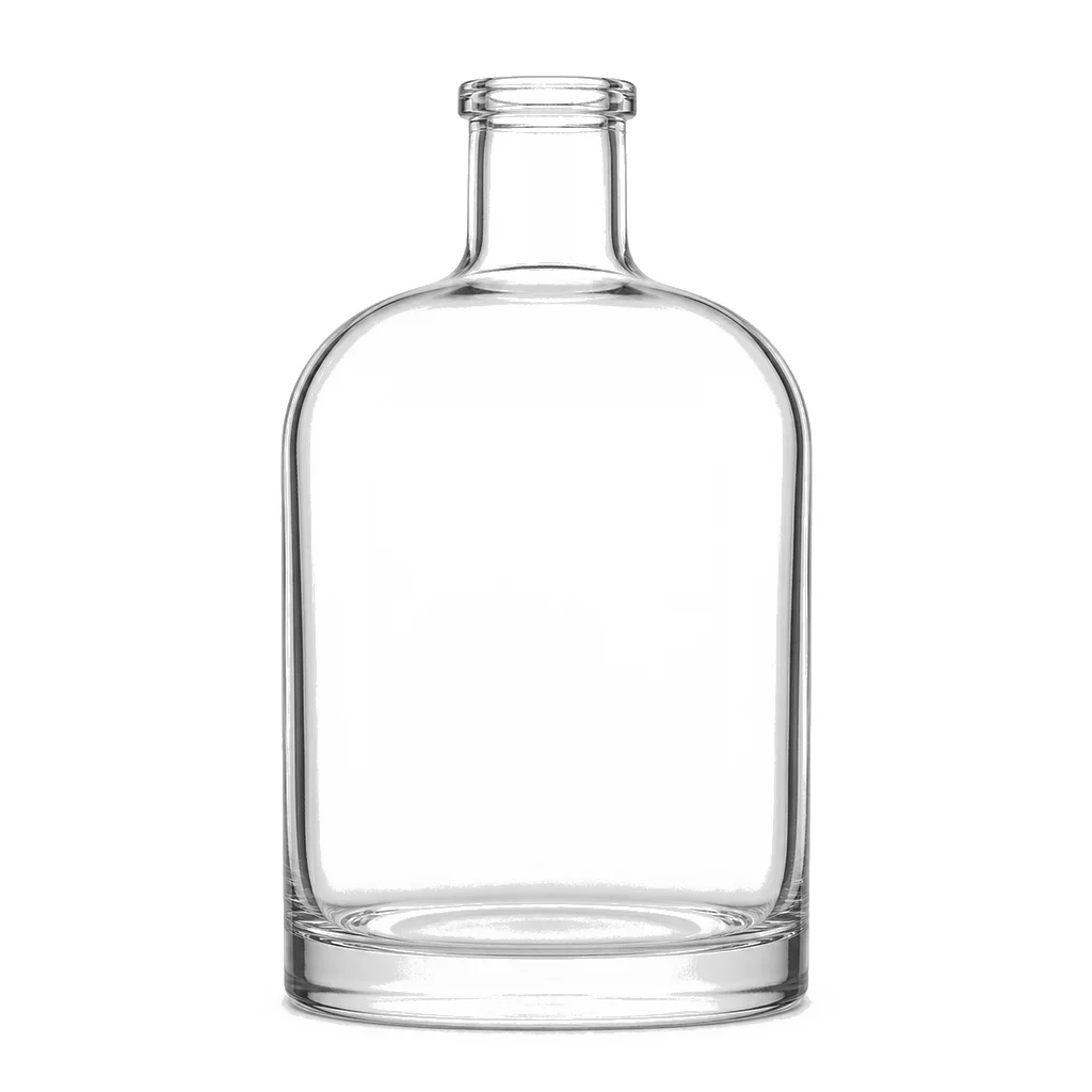
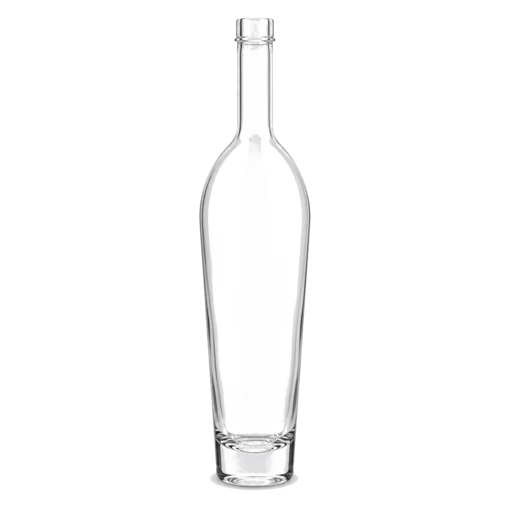
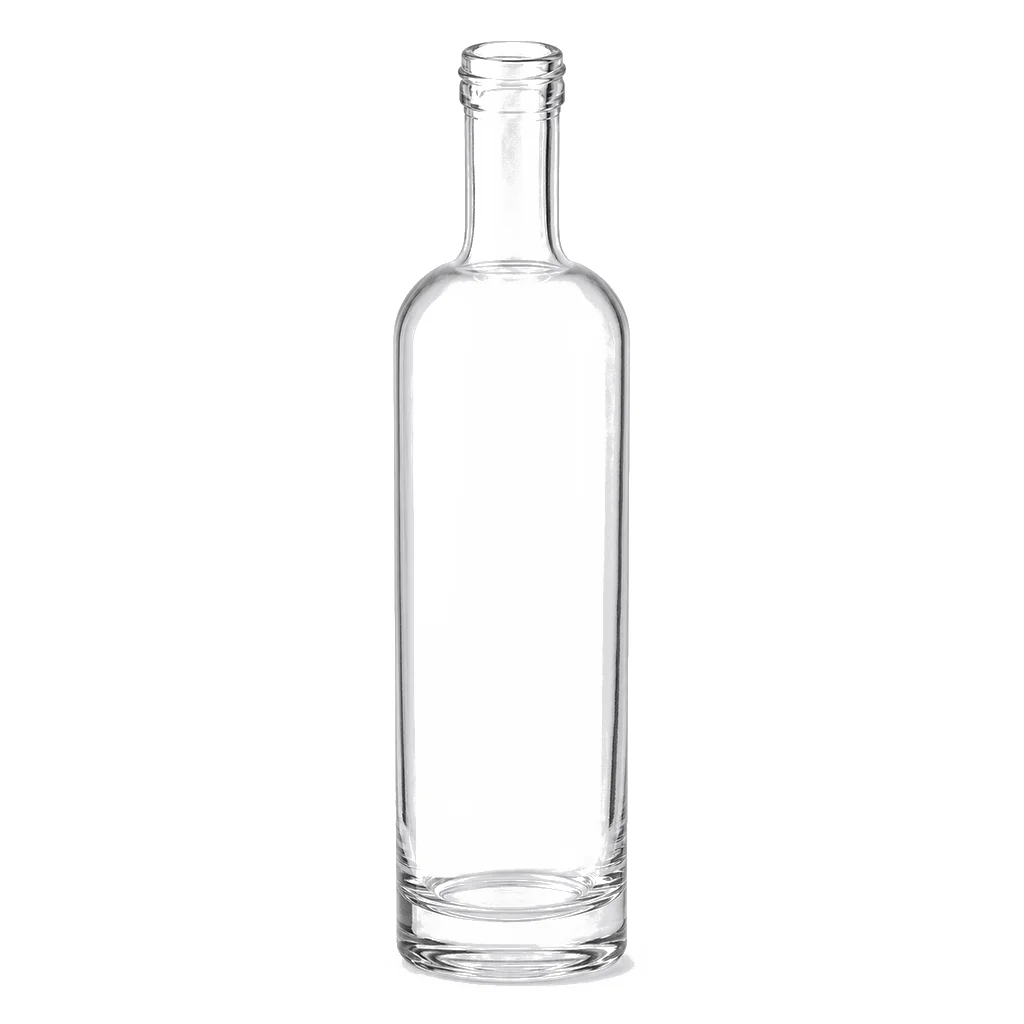
A colorless spirit in clear glass gives a customer nothing to look at except the container. Small inclusions, faint striations and slight color casts that would go unnoticed behind a whisky or a rum are visible here, and so is anything the pack contributes to a spirit deliberately made to taste of very little.
Glass defects have nowhere to hide
Seeds, bubbles, cords and slight color variation are present to some degree in all container glass and are normally invisible behind a colored liquid. Behind a clear spirit they are the product's appearance, which is why quality standards for this category are set tighter and why acceptance limits should be agreed on physical samples.
Neutrality means the pack cannot contribute anything
Vodka is produced to be clean and largely characterless, so any compound extracted from a liner, an adhesive or a coating shows up directly in the taste. At the alcohol strength involved, that extraction is a real possibility rather than a theoretical one, and it is confirmed by storage and sensory testing.
The heavy base is doing optical work
A thick base bends and concentrates light through the bottle, creating the depth and brightness the category is built on. It also adds weight low down, which improves stability and gives the bottle the substantial feel that signals a tier. It is one of the clearest cases of a decorative feature having a physical function.
Frosting and coating change the entire proposition
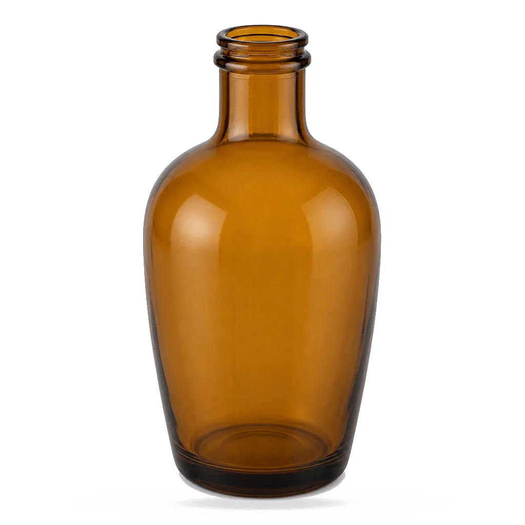
An acid-etched or coated finish turns a transparent bottle into an opaque one, hiding both the spirit and the glass quality behind it. That is a legitimate strategy and it swaps one set of requirements for another: the coating's durability and consistency become the quality issue instead of the glass clarity.
Labels behave differently on a transparent bottle
Anything applied to clear glass is seen from both sides, so adhesive coverage, edge lift and any air bubble under a label are visible through the bottle. Clear labels magnify the issue further, and label application specification deserves more attention here than in a category where the liquid conceals it.
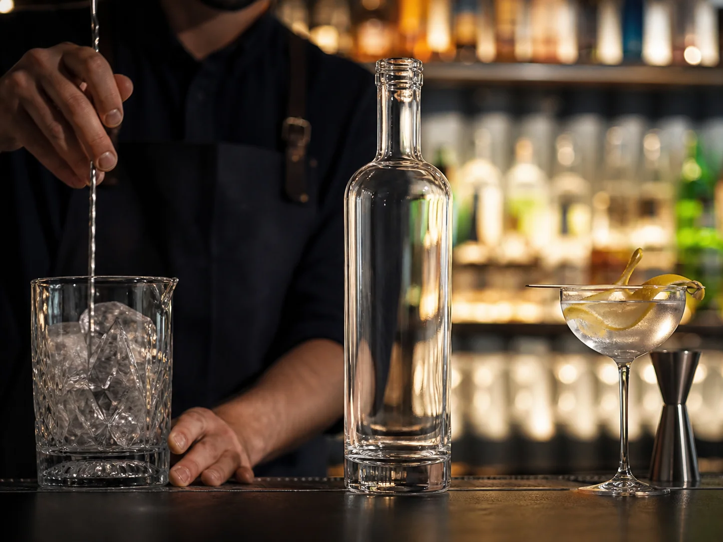
The bottle is displayed under bar lighting
Vodka spends much of its life on a back bar under directed light, which is exactly the condition that reveals optical detail in glass. Judging a design under that lighting rather than in an office is the difference between a bottle that performs where it is sold and one that only performs in a presentation.