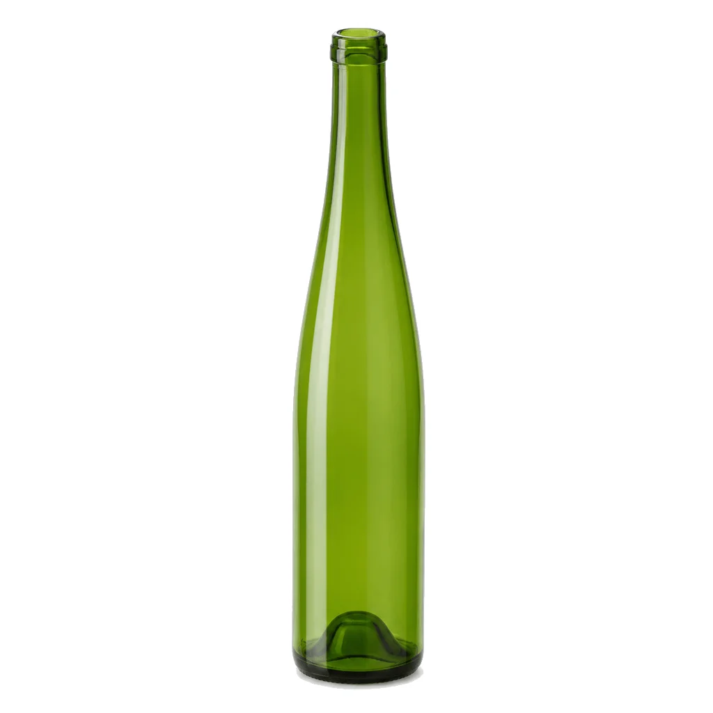
Proportions, regional color & handling
Six practical points about the flute format.
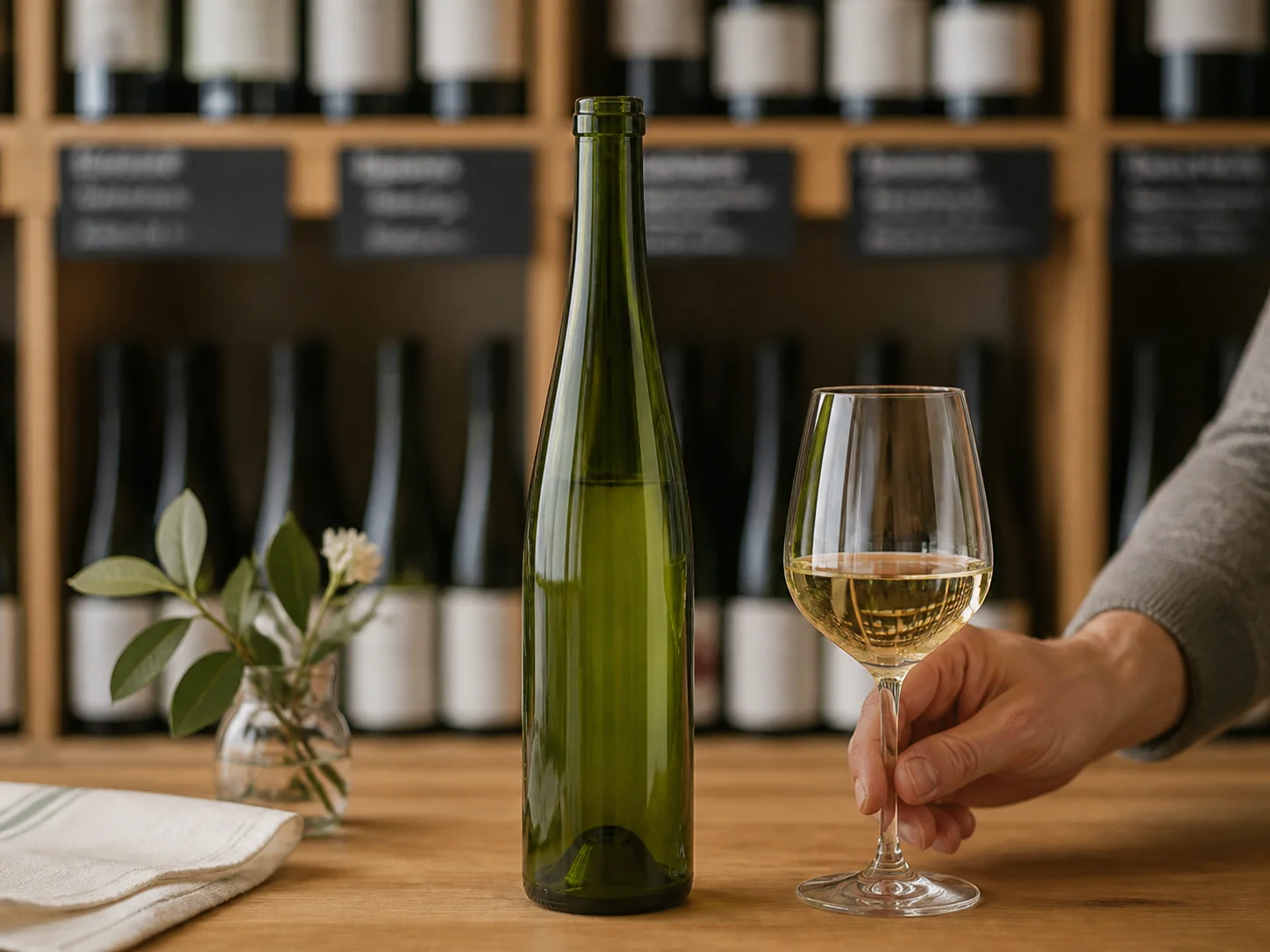
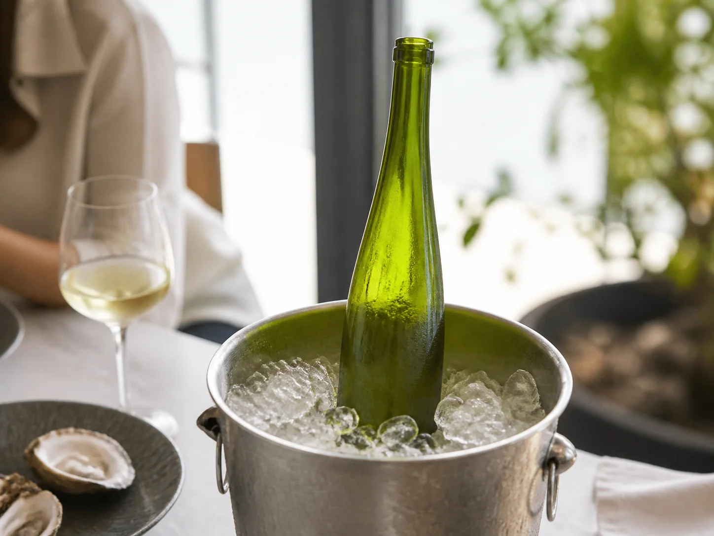
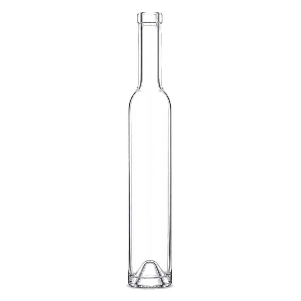
The flute holds the same volume as a standard wine bottle in a much taller, much narrower body with a long tapering neck and no punt. It signals aromatic white wine unmistakably. It also stands taller than most wine packaging is designed for, and that dimension causes more difficulty in practice than anything else about the format.
Height is the dimension that causes trouble
Wine cartons, shippers, retail racking and refrigerator shelves are largely built around a standard bottle height. A flute exceeds it, so cartons need to be checked, dividers may need remaking and some retail fixtures simply will not take the bottle upright. Measuring before committing avoids all of it.
Glass color follows regional tradition and carries meaning
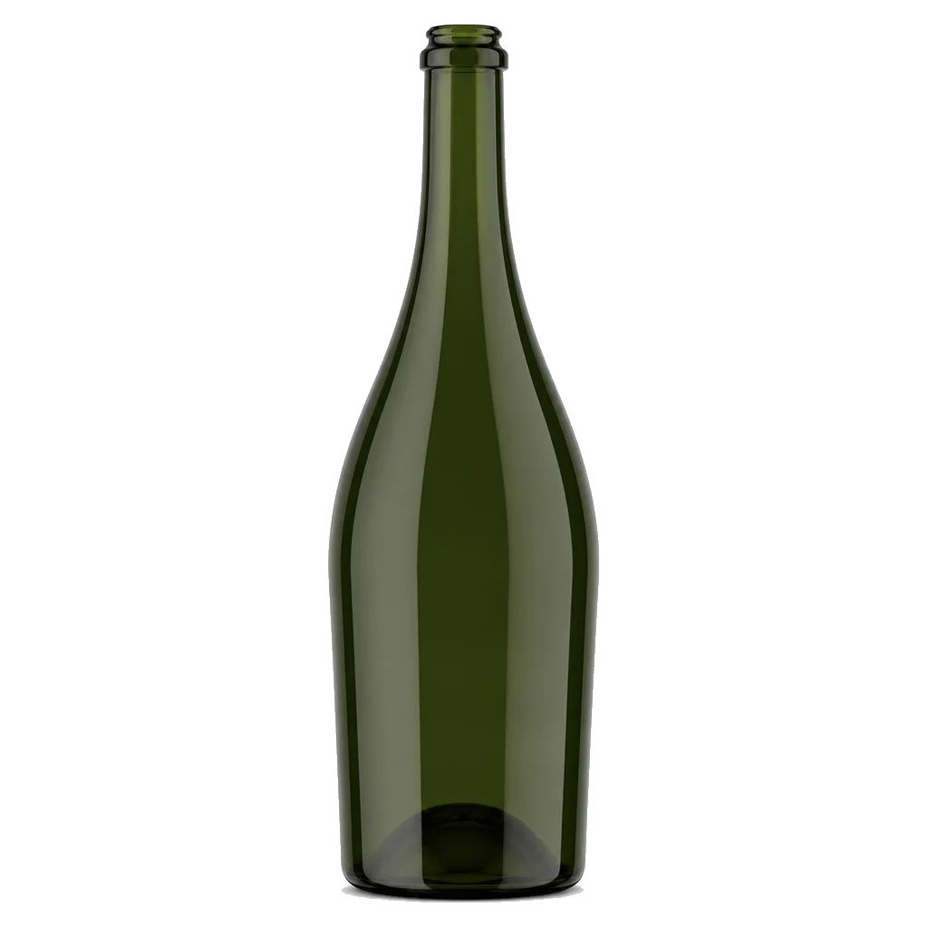
Brown and green flutes are associated with different growing regions, and within the category customers and trade buyers read the difference. Choosing a color is therefore a positioning decision rather than a free aesthetic choice, and it is worth understanding what the intended market takes it to mean.
The narrow body leaves little label area
For the same volume the body is considerably narrower, so a label designed for a standard bottle will not fit and cannot simply be scaled down without becoming illegible. Artwork for a flute is usually redrawn taller and narrower, and the mandatory declarations should be laid out before the design is finalized.
No punt, and none needed
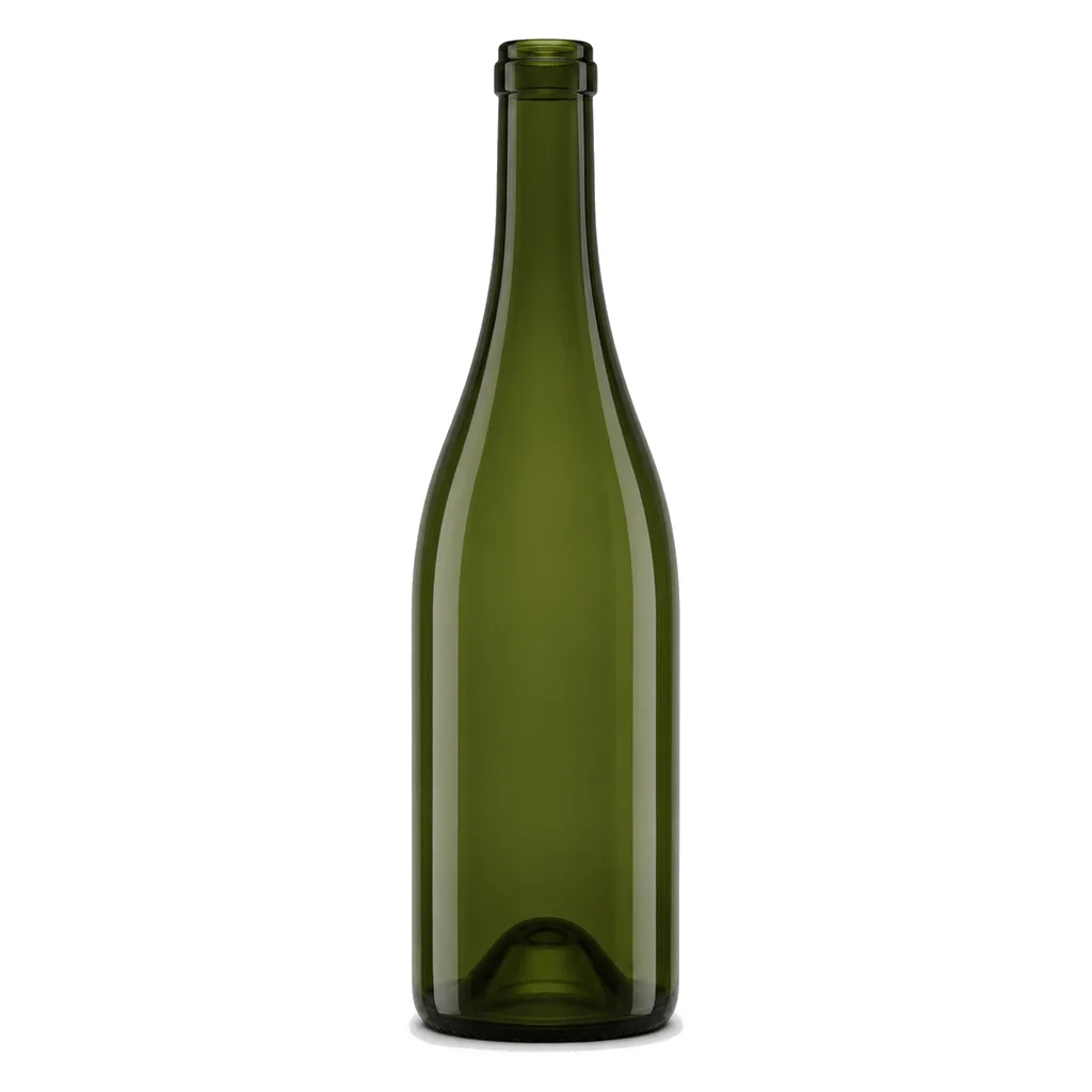
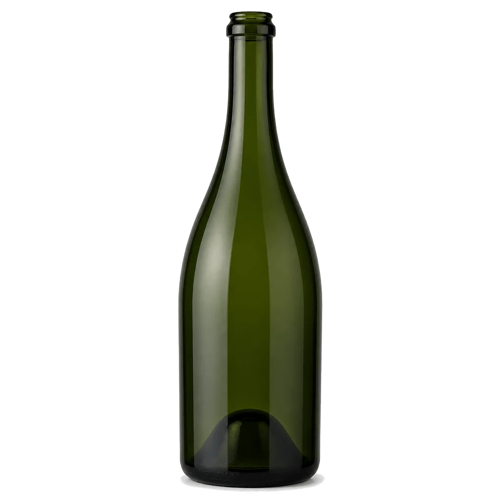
Flutes are traditionally made without a punt, which reduces glass weight and makes the bottle sit flat. In a still wine there is no structural argument for a punt, so its absence is a straightforward simplification rather than a compromise on quality — despite the association a deep punt carries in other wine categories.
A tall narrow bottle is easier to knock over
The proportions raise the center of mass and reduce the base footprint, which makes the bottle less stable on a conveyor, in a wine cooler and on a table. It is manageable, and it argues for careful attention to line guiding and to how the bottle is presented in secondary packaging.
The wines in this shape are light sensitive
Aromatic white wines lose freshness and can develop faults under light more readily than robust reds, so the tinting of the glass is doing genuine work here. A clear flute looks beautiful and offers the least protection, which is a trade worth making consciously against how the wine is displayed and how long it sits.