Shade visibility, suspension behavior & dosing
Six requirements that come from selling a color in a bottle.
A customer buying foundation is buying a shade, and a shade they cannot see is a shade they will not risk. That makes clear glass close to mandatory and makes every other decision — closure, dosing, decoration — work around keeping the product visible. Behind that sits a suspension that separates on standing and has to be remixed before use.
The pack has to show the shade
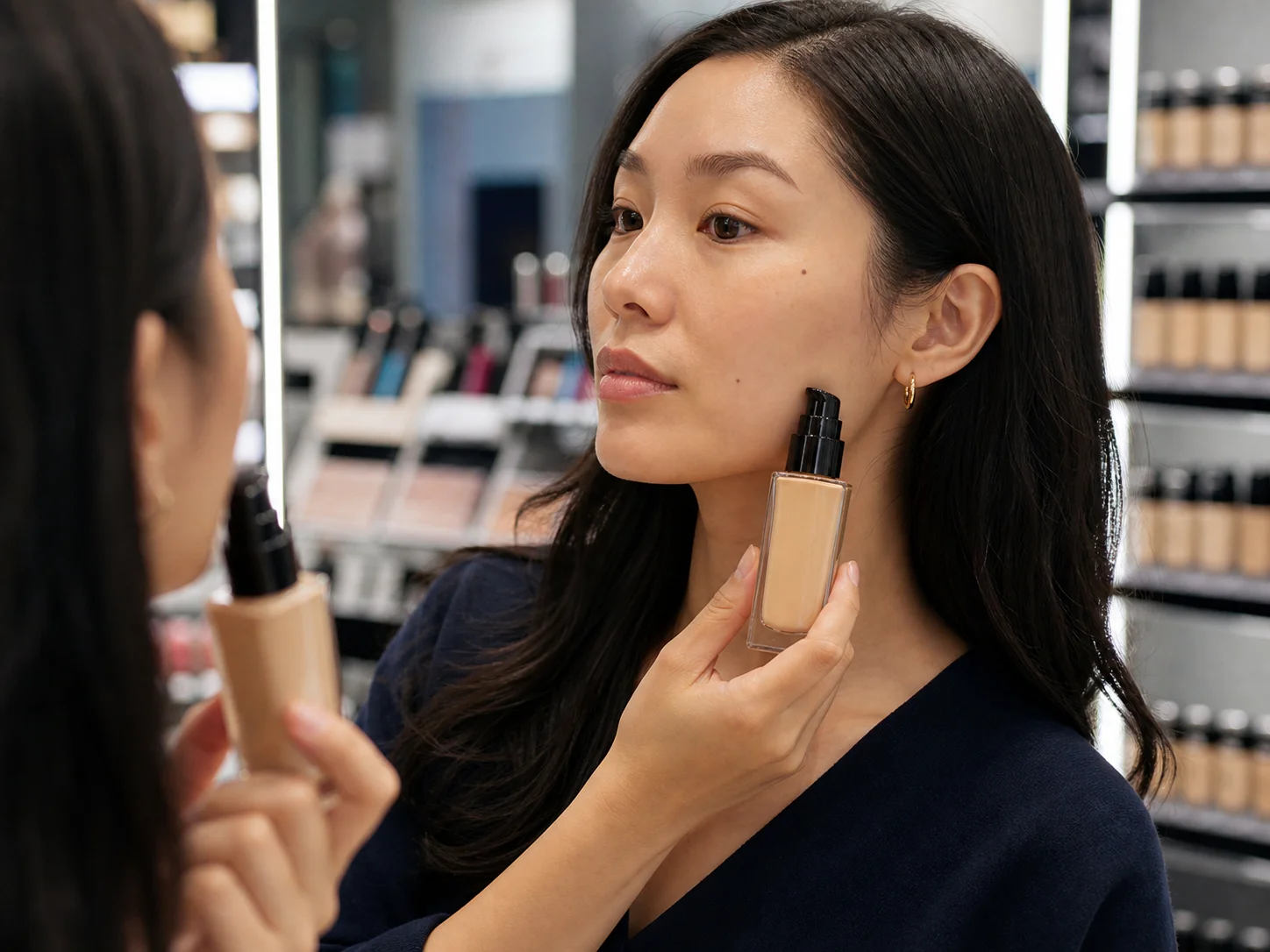
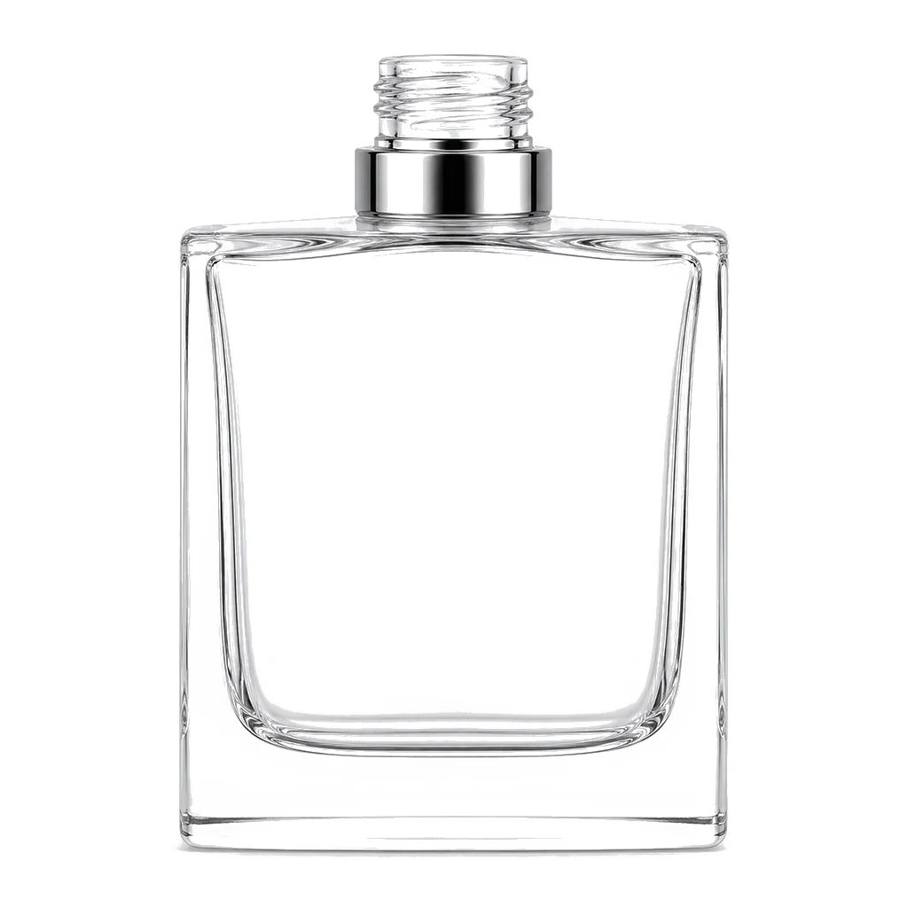
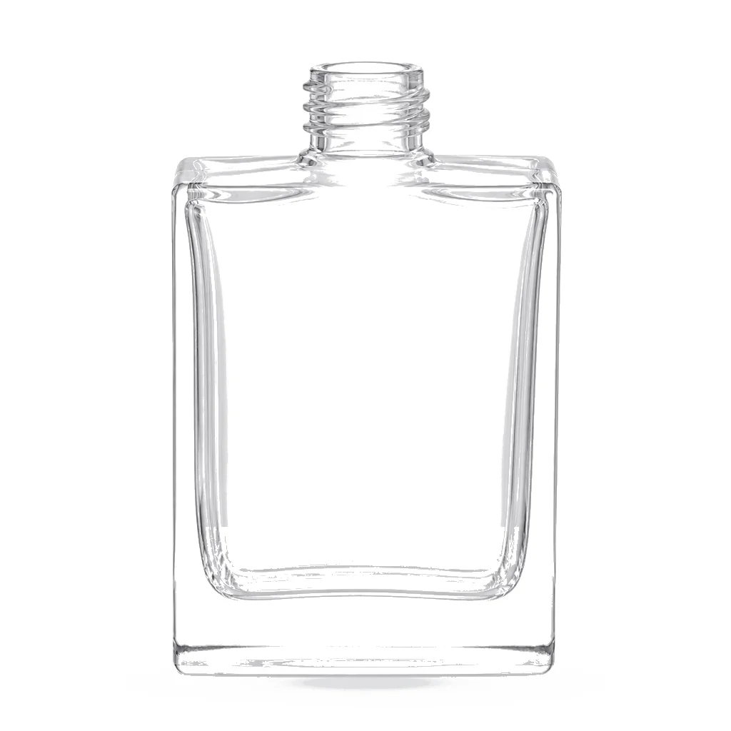
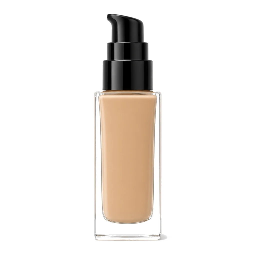
Foundation is chosen by matching a color to skin, and an opaque or heavily tinted bottle removes the customer's ability to check. That rules out most decorative finishes on the body and pushes branding onto a small label, a printed panel or the cap. It is one of the few categories where clear glass is a functional requirement.
Pigment settles, and the pack should say so
Foundations are suspensions, and pigment separates on standing however well the formula is built. A customer who sees clear fluid at the top of a new bottle assumes a fault unless told otherwise. A shake instruction on the label converts an apparent defect into normal behavior, and it costs a line of text.
Settling makes the dip tube position matter
Denser pigment collects at the base, which is exactly where a pump draws from. A first stroke after standing can therefore deliver a heavily pigmented dose. That is another argument for the shake instruction, and it is worth checking dose consistency after a period of standing rather than only on a freshly agitated bottle.
Dose control matters more than volume
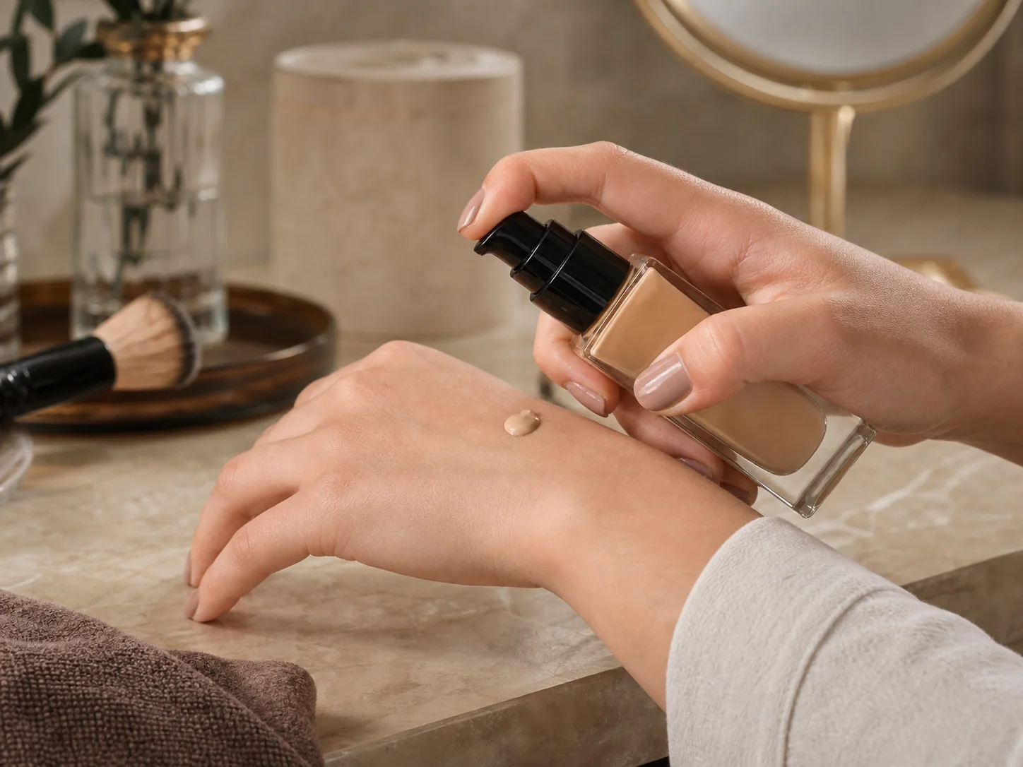
Foundation is applied in small amounts and over-dispensing wastes an expensive product and produces a heavy finish. A pump or a dropper gives control that pouring does not, and the choice between them follows the product's viscosity and the application ritual rather than the fill size or what the range's other bottles use.
Shade names and label area fight each other
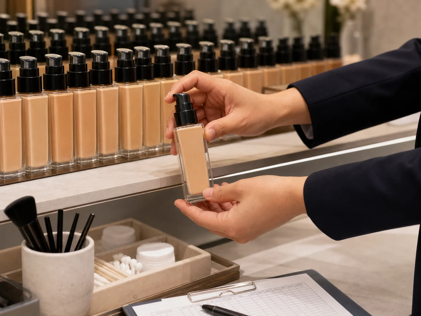
A foundation range carries many shades, each needing a name, a number and often an undertone descriptor, on a bottle deliberately left mostly clear. That squeeze is real, and it usually resolves into a small wraparound label at the base or a printed shade panel, both of which have to be legible at retail lighting levels.
Shade matching happens under store lighting, and the glass is part of it
A tinted or frosted bottle shifts the apparent shade of what is inside, which is the one thing a customer must judge accurately before buying. Clear glass at least at the point where the product is visible is a functional requirement in this category rather than a stylistic preference.